DWC Custom Configuration
-
This post is deleted! -
@arnold_r_clark said in DWC Custom Configuration:
I.M.H.O.P. I feel the product 100% SHOULD do a better job of being configurable for item placement, colours and font etc.
Once again: you can use Btn_Cmd for designing relatively easy your own tabs. With free button placement, millions of colors for the buttons and without learning a programming language.
When you buy a Duet Board, you know what you get. The hardware and software is well documented. When you read the docu, you can more or less imagine, what is possible and what not.
Nowhere is written that we easy can make our own layouts in DWC!I don't know where you get the idea that all of this should be configurable?
When you buy a car, and you'd like to change the rims? You need tools and the skills... or somebody, who can make it for you!
When you buy Windows, you can't change the complete Layout to your needs! -
@cosmowave said in DWC Custom Configuration:
When you buy a Duet Board, you know what you get...
...except that the controller itself is almost infinitely configurable. If you want, you can configure the controller to be a 3d printer, or a CNC machine with endless tools, or it can be an automatic 9 axis gcode driven kitten grinder. THAT is what the Duet board is; a stepper motor oriented machine thinkbox for anything that you need it to be.
Many of the firmware changes in recent years have literally been about removing assumptions of what the machine's purpose is, to be more of just a set of facilities ready to do whatever you want them to do.
You cannot, however, configure the user interface to do what you want it to be, for your specific purpose. A plugin doesn't override many assumptions made in the interface about the priority of the machine.
Why can't the UI move a little in the same direction?...
If the default config has it work exactly how it currently works, why do you care that there's a configuration option that hides the status components even on a large screen?...
The OP needs to convince a coder and maintainers to create and merge the feature... that's a large task... but why in heck do people go out of their way to block it from happening?...
-
I want one of those 9 axis kitten grinders now ..... maybe adopt it to handle puppies or upscale it as a Bambi grinder ... wooohoooo ....
BTW, since the hardware/firmware are built by one person and DWC is built by another person (who as far as I know is a volunteer), rather than jumping up and down it would be better to be thankful of what you have. I am sure that a request for additional features, if done nicely, would go far .... jumping up and down will get you nowhere.
The above is a general comment and not directed at anybody.
-
@jens55 ...absolutely. Anyone who's not a dev, who has a feature suggestion, has to try and convince the maintainers to care enough to work on it. And that's fine. If a maintainer doesn't care about it, then it doesn't get done, and I support that choice... but when others put up road blocks, insisting it's not needed, that's what weirds me out.
I think literally everyone who's a fan of the Duet is crazy thankful for the controller and the web interface. There's no other controller this configurable in general.
And as crazy good as the web interface is, the fact it can be changed with a web page tech means it's actually super adaptable. The Ooznest CNC interface being the perfect example, but now those features are rolled into the main branch, which is epic sauce and congrats to everyone!
I'd like to see the UI be more configurable... my day job is VueJS development, so I plan to look into what would be pragmatic. If I ever come up with something, I'll push it somewhere, make a PR, and then the maintainer(s) can decide to merge it or not. And I would be fine with it not being merged... but, it would also mean that it's in a public repo, and people could download my fork if they wanted.
...this is how open source goes

-
For a long time before plugins became available I used to keep a fork of the DWC with my GCode Viewer. A few folks used to use my fork for the feature. Once plugins became available I converted my code to utilize the plugin functionality. I feel plugins will be a great way forward for customization, btncmd for example. I think there is always a possibility for adding the ability to customize themes and maybe even content blocks but those take work. The other issue is that everyone has a different use case and what they consider “an optimal user interface”. Having folks put together something maintainable as an example can go a long way toward getting features and functions added to the ui. The merge of the DWC-CNC into the base is a fairly recent example of this. I think the Duet team is open and flexible to additions in the future but they don’t happen overnight and they have to take into consideration the larger group and that may not always reflect a given persons desirements.
-
@sindarius ....I'm curious about what people's reservations are. This is all about doing things by configuration, so unless you dig into the config of it, people will never have to bother with knowing that it can change at all.
Here's what I'd like to see, and will look into coding myself...
Default menu configuration, to have it work exactly how it does at the moment. This would be default, sitting there unchanged, nobody needs to know it exists...
(the "key-to-dashboard-title" things are placeholders to the key references in the translated language files in the app; anything new needs to support the current abilities of the app, including all the international languages. But if it's not a language key, just render the text)
{ "mainMenu": [
    {
        "type": "group",
        "titleKey": "control-title-key-in-lang-file",
        "items": [
                    { "titleKey": "key-to-dashboard-title", "icon": "icon-class-ref" },
                    { "titleKey": "key-to-console-title", "icon": "icon-class-ref" }
        ]
    },
    {
        "type": "group",
        "titleKey": "job-title-key-in-lang-file",
        "items": [
                    { "titleKey": "key-to-status-title", "icon": "icon-class-ref" }
        ]
    },
    {
        "type": "group",
        "titleKey": "files-title-key-in-lang-file",
        "items": [
                    { "titleKey": "filaments-title-key", "icon": "icon-class-ref" },
                    { "titleKey": "jobs-title-key", "icon": "icon-class-ref" },
                    { "titleKey": "macros-title-key", "icon": "icon-class-ref" },
                    { "titleKey": "system-title-key", "icon": "icon-class-ref" }
        ]
    },
    {
        "type": "group",
        "titleKey": "settings-title-key-in-lang-file",
        "items": [
                    { "titleKey": "general-title-key-in-lang-file", "icon": "icon-class-ref" },
                    { "titleKey": "machineSpecific-title-key-in-lang-file", "icon": "icon-class-ref" }
        ]
    }
]}
...with an additional ability to set reserved spaces for plugins to show up.
But, if someone wants to completely hack it up to their whim, the following changes the control group, flattens the other groups, put a plugin in place of the dashboard, and maybe even put a gcode button as a first class citizen...
{
  "mainMenu": [
    {
      "type": "group",
      "title": "My Super Awesome Menu",
      "items": [
        {
          "title": "Dashboard",
          "plugin": "mySuperPlugin",
          "icon": "super-awesome"
        },
        {
          "titleKey": "key-to-console-title",
          "icon": "icon-class-ref"
        },
        {
          "title": "Macro Things",
          "plugin": "BtnCmd",
          "icon": "whatever"
        }
      ]
    },
    {
      "title": "Dashboard",
      "plugin": "mySuperPlugin",
      "icon": "super-awesome"
    },
    {
      "titleKey": "key-to-status-title",
      "icon": "icon-class-ref"
    },
    {
      "titleKey": "filaments-title-key",
      "icon": "icon-class-ref"
    },
    {
      "titleKey": "jobs-title-key",
      "icon": "icon-class-ref"
    },
    {
      "titleKey": "macros-title-key",
      "icon": "icon-class-ref"
    },
    {
      "titleKey": "system-title-key",
      "icon": "icon-class-ref"
    },
    {
      "title": "FUNKY MACRO",
      "gcode": "G28",
      "icon": "icon-class-ref"
    }
  ]
}
...again, if people don't change the cofig, they don't even have to know it's possible to care about it.
This is the kind of configuration that would help developers make the core functionality let alone give a way for people to manipulate it as they wish. It's the kind of thing I do at work all the time, make things configurable... when people come to me to ask for a change, I say it's already possible and they could have done it themselves from the settings panel or whatever. Good fun.
-
After poking the source code, my guess above was already pretty darn close to how it already is. The root of the routing code...
export const Menu = Vue.observable({
	Control: {
		icon: 'mdi-tune',
		caption: 'menu.control.caption',
		pages: []
	},
	Job: {
		icon: 'mdi-printer',
		caption: 'menu.job.caption',
		pages: []
	},
	Files: {
		icon: 'mdi-sd',
		caption: 'menu.files.caption',
		pages: []
	},
	Plugins: {
		icon: 'mdi-puzzle',
		caption: 'menu.plugins.caption',
		pages: []
	},
	Settings: {
		icon: 'mdi-wrench',
		caption: 'menu.settings.caption',
		pages: []
	}
})
...with a component self-registering into the menu and the route with...
		registerRoute(this, {
			Control: {
				Dashboard: {
					icon: 'mdi-view-dashboard',
					caption: 'menu.control.dashboard',
					path: '/'
				}
			}
		});
...just externalise this configuration. I can't think of any reason why this couldn't/shouldn't be done.
.If people can have control of the menu, they could promote a plugin to take the place of the dashboard, and then they are, for all intents and purposes, in control of just about everything in the interface.
-
Chipping in as we seem to have a number of plugin devs on this thread, and to possibly help the OP query.
@Dr_Ju_Ju The DWC top section can be hidden (as mentioned in an earlier post) if you happen to running on mobile. A button appears to show hide the section. I have looked at the code and it only requires the DWC dev @chrishamm to change 2 lines of code to enable that button for all screen sizes. I see no functional reason why this change cannot be requested to be included in the next release if @chrishamm agrees. Hopefully this would help alleviate some of your frustration.

From a plugin dev perspective I personally would like the change to go one step further and make the show/hide button function addressable through the JS Dom (it may already be, I just haven't tried yet). This way plugin dev's can use/offer the option to show hide the top section in their UI if required. This seems like a low impact way of making this feature more useful, without compromising existing functionality.
Going forward if this change were to be made, I would expand BtnCmd to include more DWC info/control panels (I only offer a small selection currently) enabling a user to effectively pick and choose the panels they want on screen, which would go some way to meeting the demand for more customisation options.
I can see this being helpful for other plugins where more screen real estate would be desirable - heightmap - gcode viewer etc....
Thoughts?
Given the amount of interest this post has generated I would be interested to hear @chrishamm thoughts on these proposals / discussion.
Update: For the plugin devs
window.document.getElementById("global-container").hidden = true;does already work to show/hide top section - (I had to have a go
 )
) -
@mintytrebor It would be nice if the web control was more modular and you could pick which modules to enable. I had to use your plugin to create a custom simpler interface because the default is too much for my needs. But the unecessary parts still load and take away from the user experience


-
@chimaeragh I've not used the button plugin, but perhaps it would help the developers of both that and the main part of DWC if you could explain a little more as to what parts of your current setup you find unnecessary and how they take away from the user experience?
-
@gloomyandy ...I've never once been on the filaments screen, even when using my 3d printer. My CNC doesn't even know what a filament is but that screen is still there. Similarly I've never used the macro screen as I set up macros and such to launch off buttons from my own button plugin, which also takes over from the Dashboard... three whole screens I'd like to have removed from the menu.
-
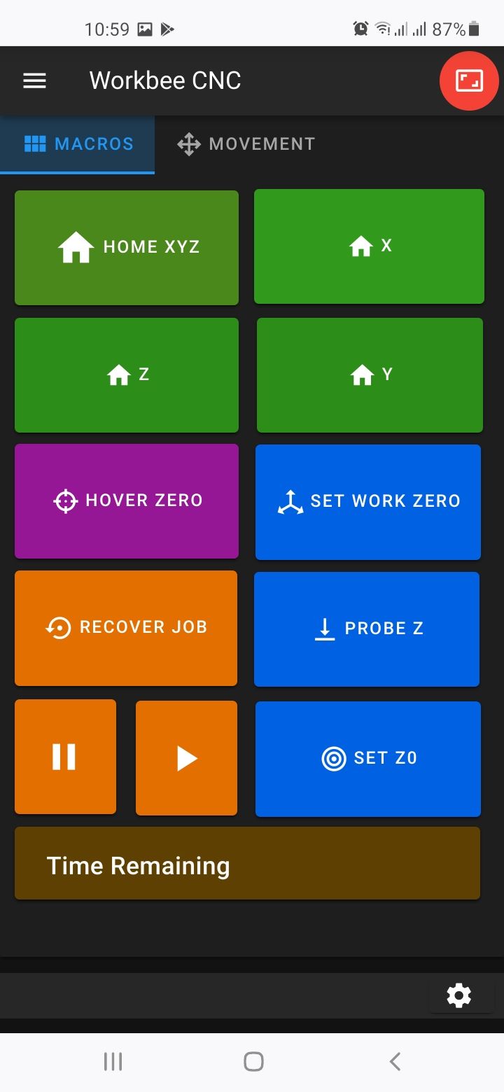
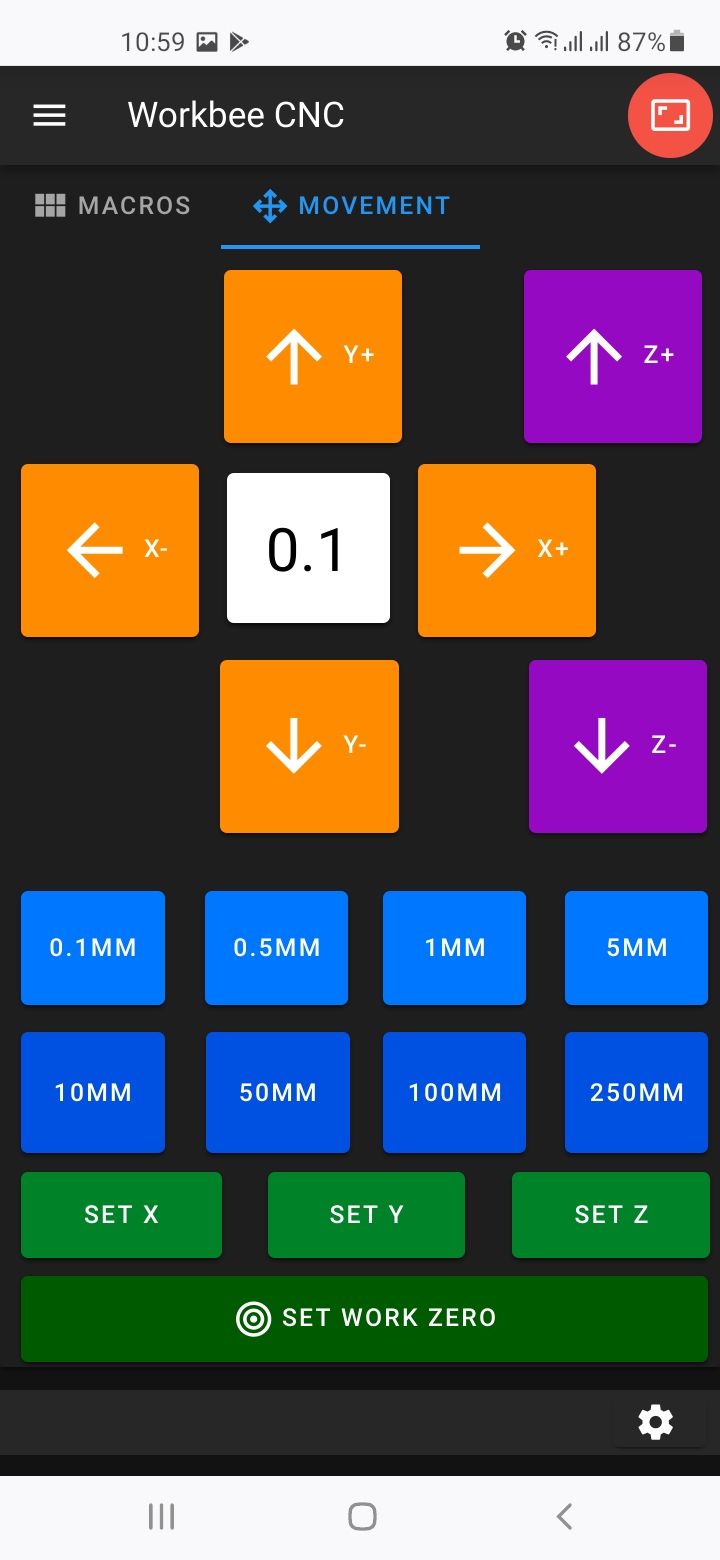
@gloomyandy Other than Files --> Jobs, the above screenshots are the only interface elements I would usually need to control my Duet from my phone. The other parts of Web Control still load and add to memory usage causing some lag. Also this plugin interface is not the default when I open DWC, I still have to find the plugin in the side panel and open it from there. Then I have to click the icon to hide the rest of the interface.
When a job starts the interface automatically switches to Job Status which is not really optimised for my use case. I prefer the first screenshot as I only need to pause or see the time remaining when I start a job on my CNC. Speed factor and baby stepping can be handled by the BtnCmd plugin but I don't need Layer Height, Filament, Extruder etc when running a job. It makes finding the information you need more difficult. I would propose hiding unpopulated labels from showing in DWC. That should give a cleaner interface. -
@dr_ju_ju said in DWC Custom Configuration:
Is there any way to easily customise the DWC pages, without reverting to additional HTTP pages etc ??
I especially want to get rid of the ridiculous/superfluous three boxes at the top of every screen, two which are effectively displaying the same information !!
Our thought was to modify it like the side menu with a button that toggles its visibility, but we haven't got around to messing with it yet.
-
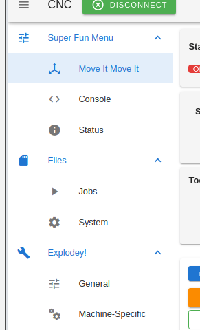
I have my menu driving by configuration now; can place and configure where the default pages sit (and omit if not desired; macros and filaments pages removed below), place plugins into specific order (my "move it move it" is a plugin)... I just need to get it loading out of the vuex settings loader and backwards compatability for plugin registration so they can keep working as-is...

-
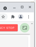
@oozebot ...there's already a button in the top right that does it, but for some reason is set to hide on large screens.
-
@thekm I was referring to adding a second button (like the one that exists for the menu) to hide/show the Status, Tools, and Temp Chart..
-
@oozebot ...it just sounds like this green button is exactly what you're describing... because it toggles the Status component, etc (the same way that the menu button works)...

I was thinking the same thing, until I was messing with the UI yesterday, resized to smaller browser to test responsiveness of something and there it was.
-
@thekm hmm - never noticed that! Unfortunately, that's only visible when the window is quite small.. and it looks like it reverts when the window is resized. I'll mess with it in code when I have a chance.
Thanks for pointing it out!
-
@oozebot ...three line change to have it stay put all the time; in App.vue, remove "hidden-md-and-up" from the button, and "|| $vuetify.breakpoint.mdAndUp" from the panel container and divider.