[Req] Visual Cue for endstop plugin
-
Howdy Gents and if there are any, Ladies.
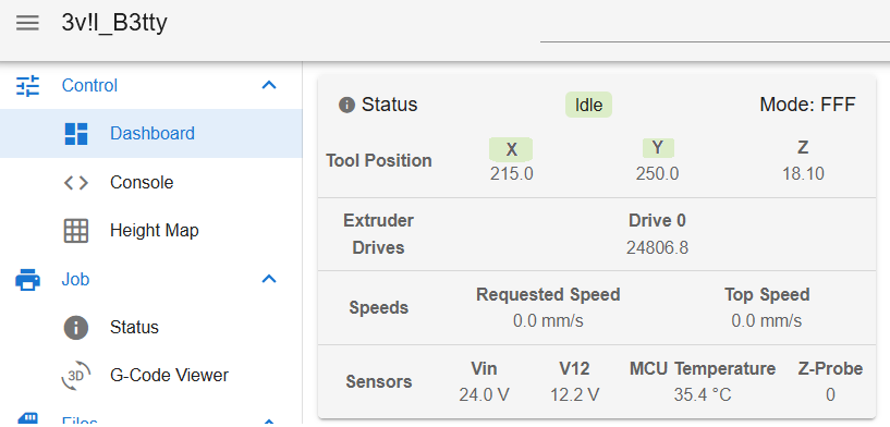
Small request, for the endstop plugin, could we not show the status by highlighting the axis at the top or add a little block next to each that is only on or off based on whether it's triggered or not? (the reason I say it that way is because setting up endstops in grbl confuses the hell out of me, I never know if red or green is triggered
 )
)At my age, when working on the printer, text is hard to read from across the room when I'm trying to see if stuff is triggered or not, a visual cue is easier than text, and it's nice to have on every page so when building, you don't have to get up, walk over to the pc, check, come back, turn off, adjust, turn on, walk over again.
Something like this perhaps? (Excuse my awesome paint skills)

-
@ShaunCro what's wrong with the endstop plugin now? That lights up the axis green when the endstop is triggered when you're testing them
https://plugins.duet3d.com/plugins/EndstopsMonitorPlugin.html -
@jay_s_uk nothing wrong with the plugin itself. but the fact that a plugin is needed at all is perhaps the problem.
Endstop status should be on Dashboard and you shoudnt have to install a 3rd party plugin and then hunt into Machine Specific > Endstops to find it.I dont get why VIN voltage is listed in dashboard but endstops are not endstop status for each axis
DWC interface could use a total refresh its layout. feels like hasnt changed much in last 5 years wish it was easier to modify/customize.
Mobile version is even more frustrating to use IMO
Wish I had the skills to program something for it myself
-
@jay_s_uk would be nice that it's visible from a static screen at all times, it's helps big time while building which I tend to do alone after hours with my monitor half way across the room. Text is a bit small with my aging eye's, and if I change something and walk back to check, odds are that I'm going to walk back to change it to endstop screen again. But, I have the plugin installed, and I do use it, just the visual cue at the top makes more sense and easier for all.
-
@Adamfilip said in [Req] Visual Cue for endstop plugin:
Mobile version is even more frustrating to use IMO
Wish I had the skills to program something for it myselfagree on both accounts here. Been in IT for 21 years, but can't program for the life of me. Different mindset needed. I lack that. I prefer my puzzles.
-
@ShaunCro Thanks for the idea, it will be implemented in 3.5-b2.
-
Whoop whoop!
