Request to reduce the amount of padding
-
I'm posting this under the Duet Web Control wish list.
Here is a screen shot of my configuration using 6 tools, each with 2 heaters.
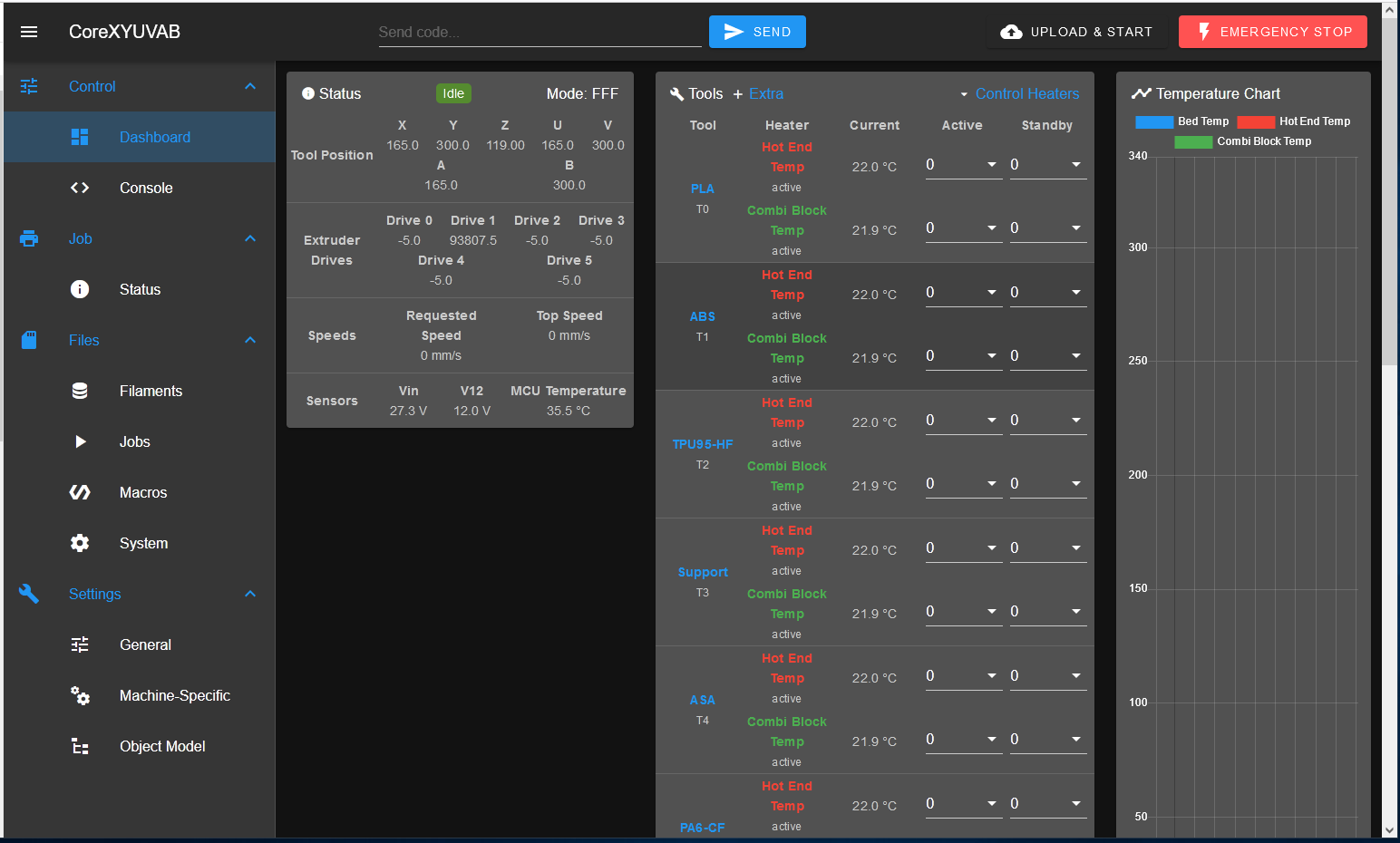
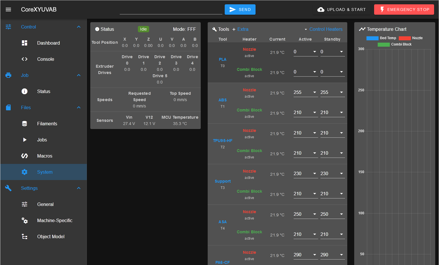
I can't see the last tool , let alone the axis homing and movement buttons unless I scroll down a fair way. I thought that if I change the the heater names so that they fit on one line, it would help to bunch things up a bit. But it doesn't - the 12 rows that I saved are simply padded out with useless blank space thus.......
If I want to get at the fan controls, I have to scroll down so far that I lose the tools altogether.
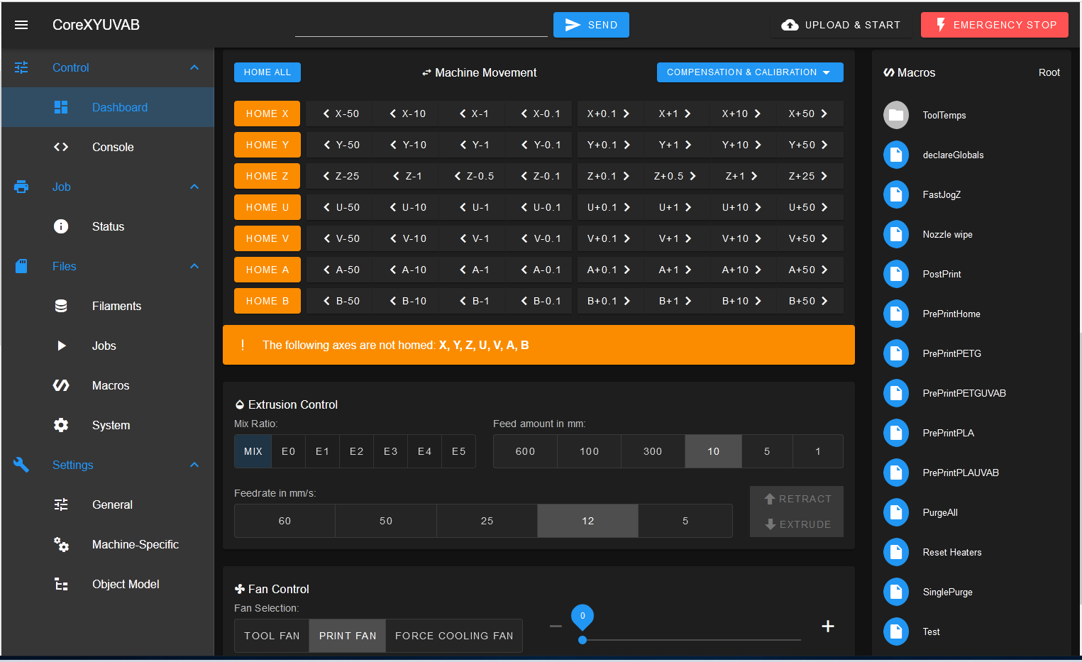
Now I appreciate that not many people use 6 tools and 7 axes. In an ideal world I'd like to see a much more customisable GUI but in the meantime, reducing the amount of padding would be a big help.
-
On the basis that my post above was upvoted by both @Phaedrux and @T3P3Tony, but that I've the behaviour persists in DWC 3.4, I'm giving this a shameless bump in the hope that it will bring it to the attention of @chrishamm.
-
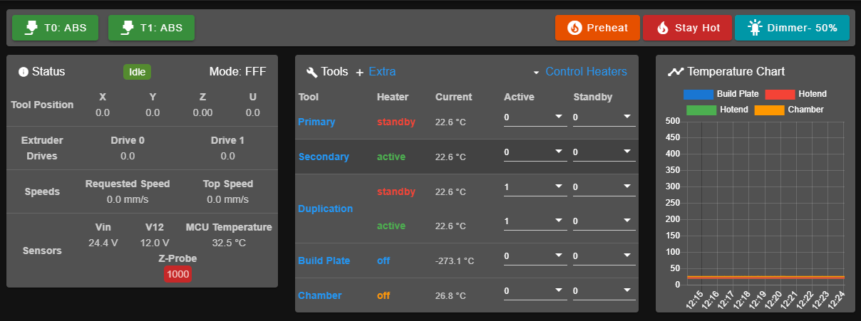
@deckingman I'll second the bump because even on a humble IDEX system with both tools, and copy and mirror mode tools defined, you can't show all of them on a 14 inch screen (i.e., my laptops) without reducing font size to dust spec sizes.
-
 undefined deckingman referenced this topic
-
 undefined deckingman referenced this topic
-
This post is deleted! -
We agree the tool panel can get unwieldy.. To combat this, here is what our custom DWC has whittled it down to. Note we removed the label for each heater as it's redundant for our usage. For posterity - most of the padding is coming from the dropdowns - setting the "dense" flag in the v-combobox removes it.
