DWC Custom Configuration
-
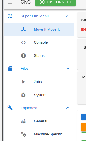
@gloomyandy ...I've never once been on the filaments screen, even when using my 3d printer. My CNC doesn't even know what a filament is but that screen is still there. Similarly I've never used the macro screen as I set up macros and such to launch off buttons from my own button plugin, which also takes over from the Dashboard... three whole screens I'd like to have removed from the menu.
-
@gloomyandy Other than Files --> Jobs, the above screenshots are the only interface elements I would usually need to control my Duet from my phone. The other parts of Web Control still load and add to memory usage causing some lag. Also this plugin interface is not the default when I open DWC, I still have to find the plugin in the side panel and open it from there. Then I have to click the icon to hide the rest of the interface.
When a job starts the interface automatically switches to Job Status which is not really optimised for my use case. I prefer the first screenshot as I only need to pause or see the time remaining when I start a job on my CNC. Speed factor and baby stepping can be handled by the BtnCmd plugin but I don't need Layer Height, Filament, Extruder etc when running a job. It makes finding the information you need more difficult. I would propose hiding unpopulated labels from showing in DWC. That should give a cleaner interface. -
@dr_ju_ju said in DWC Custom Configuration:
Is there any way to easily customise the DWC pages, without reverting to additional HTTP pages etc ??
I especially want to get rid of the ridiculous/superfluous three boxes at the top of every screen, two which are effectively displaying the same information !!
Our thought was to modify it like the side menu with a button that toggles its visibility, but we haven't got around to messing with it yet.
-
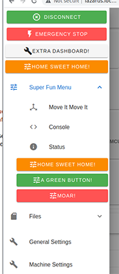
I have my menu driving by configuration now; can place and configure where the default pages sit (and omit if not desired; macros and filaments pages removed below), place plugins into specific order (my "move it move it" is a plugin)... I just need to get it loading out of the vuex settings loader and backwards compatability for plugin registration so they can keep working as-is...

-
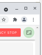
@oozebot ...there's already a button in the top right that does it, but for some reason is set to hide on large screens.
-
@thekm I was referring to adding a second button (like the one that exists for the menu) to hide/show the Status, Tools, and Temp Chart..
-
@oozebot ...it just sounds like this green button is exactly what you're describing... because it toggles the Status component, etc (the same way that the menu button works)...

I was thinking the same thing, until I was messing with the UI yesterday, resized to smaller browser to test responsiveness of something and there it was.
-
@thekm hmm - never noticed that! Unfortunately, that's only visible when the window is quite small.. and it looks like it reverts when the window is resized. I'll mess with it in code when I have a chance.
Thanks for pointing it out!
-
@oozebot ...three line change to have it stay put all the time; in App.vue, remove "hidden-md-and-up" from the button, and "|| $vuetify.breakpoint.mdAndUp" from the panel container and divider.
-
Messing with menu config after work...
- config comes from and stored in 'dwc-settings.json' along with everything else
- default works as-is, nobody will know anything is different until they tweak the config of it themselves
- complete control over the menu; change the order of it, flatten it (remove the groupings), add buttons that run gcode including adding them to submenus, create submenus, change the icons and colours (yup, can have a menu of macros that run directly from the menu, because why not!? )
- internally the system pages are tweaked how they register in to the menu, but no-change for existing plugins to be able to plonk them somewhere specific by configuration.
Good fun.


-
 undefined chimaeragh referenced this topic
-
 undefined chimaeragh referenced this topic
-
 undefined chimaeragh referenced this topic