V2 vs V3 on smaller displays
-
DISCLAIMER - I haven't red the DWC documentation carefully - if the answer to my post is RTFM, I'm OK with that - and I did search first but didn't find anything. I doubt I'm the first person to raise an issue.
I use an iPad (Gen 4 retina display) at my printers - landscape mode. I also pop the printer interface up on my phone pretty often.
I just updated one of my printers to V3 today. I'm disappointed with DWC on the smaller displays.
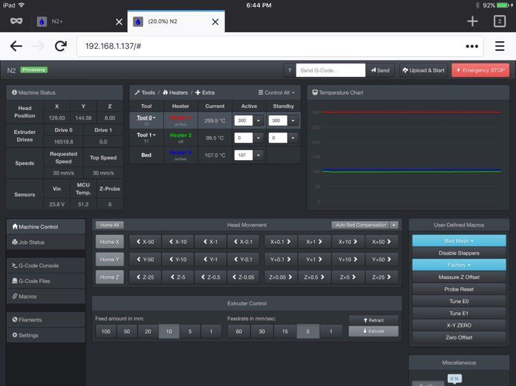
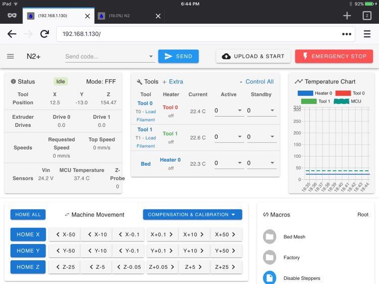
Here's a comparison of my iPad display:
DWC V2

DWC V3

On the new DWC all the elements are a lot bigger and it just feels cramped. The machine movement buttons were the first thing that really got my attention. When setting the Z-Offset in a new nozzle, the Z movements are 5mm and .05mm. On the older layout there's more room for buttons and there's a .5mm. I wrote a macro for 1mm so I could get close enough to use the .05mm.
I have to scroll to access macros - scroll to access extruder control.
The display on my iPhone is also a lot more drawn out with less room for stuff because all the elements are larger.
Would like to have a setting to scale things down so more information can fit on the display.
Thanks.