CNC Gui Thoughts
-
@3dpandme I find Ooznest's implementation an improvement over the stock DWC UI. Less 3D printing stuff but still not entirely CNC workflow friendly. You may want to take a look Workbee Control
-
@3dpandme have you seen the diabase UI? This is what I use on my CNC https://github.com/diabase/H-Series-Web-Control/tree/3.4-dev
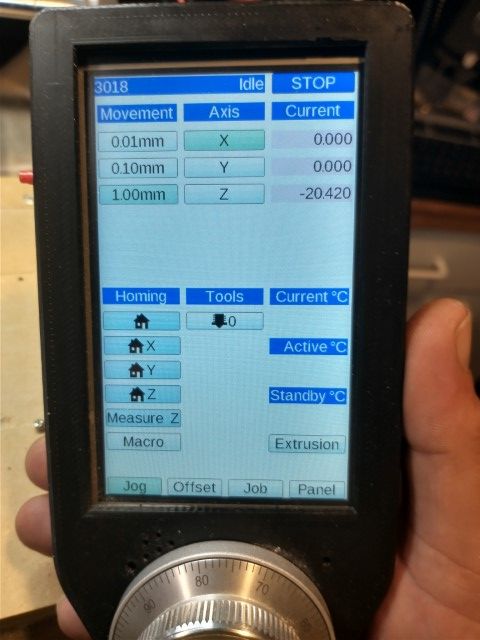
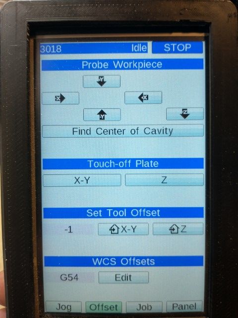
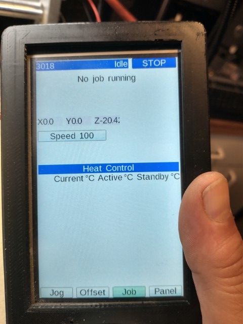
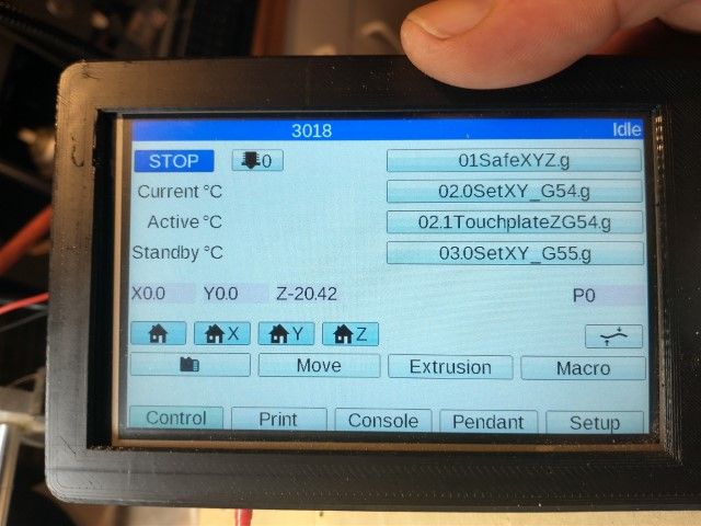
I also use their version of the paneldue interface that works with an encoder -
@jay_s_uk said in CNC Gui Thoughts:
@3dpandme have you seen the diabase UI? This is what I use on my CNC https://github.com/diabase/H-Series-Web-Control/tree/3.4-dev
I also use their version of the paneldue interface that works with an encoderditto on Diabse's UI and pendant. for what it is, its nice and clean.
while a fully featured UI like UNCC would be nice, RRF was not purposefully written to be that. You might be happier and better served with LinuxEMC.
-
Thank you guys. I don't want to re-invent the wheel so I will definitely take a look at both these options first!
-
-
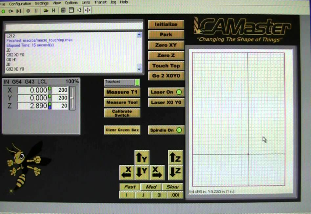
Here's the GUI from my original CNC router app (Wincnc). This is the entire GUI other than menu options/dialog boxes for settings - and I used it for years until switching out the controller to RRF. It shows position, GCode (as job runs), an image of the job running, and has jog and touch options. Initialize == home all. The "Green box" shows machine/tool position.
It was minimal but adequate.
-
@markz yes, this is what i think of when i picture a CNC controller in my mind.
Sadly, I dont think that Paneldue or DWC was ever concieved to provide this kind of functionality. I think it will take a major re-write to build in some of this and its a small market to service.
-
All
We do want to improve the CNC version of DWC however I am not sure that some of the examples of the old UIs are the best template. I am not a CNC user myself, so this is an opinion, not saying what we are or are not going todo at this point.
I get the feeling that the older UIs took the idea of a physical panel, with lots of actual buttons and maybe a small CRT screen, and then digitised that, so they are rooted (excuse the pun) in that type of layout.
It might be helpful if we have some consensus about:
- What functionality is most important to have on one screen
- What screen size/resolution is most reasonable to target.
-
These old GUIs are useful since they show every possible feature someone might want : )
I posted my very old GUI because imho it's a list of dashboard essentials:
a) a short gcode console display
b) jog shuttle options
c) a display of the cut path
d) basic home/touch buttons
e) display of current coordinates (working and machine) and speed
f) small tweaking options (speed adjust, coord space, ...)I also way prefer the jog vs the DWC jog. It's much smaller yet easier to use. The jog buttons can be held down to keep the machine moving and it has speed or distance settings.
It would be very easy in DWC to have this kind of dashboard. It's just a rearrangement of stuff already there. I'd also vote to have the Status page get promoted to a 'second dashboard' (which it is) and be thought about as a 'dashboard while the job is running'.
Mark
-
@sinned6915 Hi, which connections / pins have you used to connect the encoder to the paneldue? Thanks in advance.
